PACKAGINGDESIGN

Reinterpretations of familiar Turkish brands, plus fictional brands built from scratch, from name to packaging system.

PACKAGING
PACKAGING
PACKAGING

REPACKAGED.

Three brands with a strong place in everyday memory, reinterpreted through shelf behaviour, material and the moment of use.

These works are unofficial; there is no partnership with or endorsement by the brands.

ULUDAĞ GAZOZU

ULUDAĞ GAZOZU
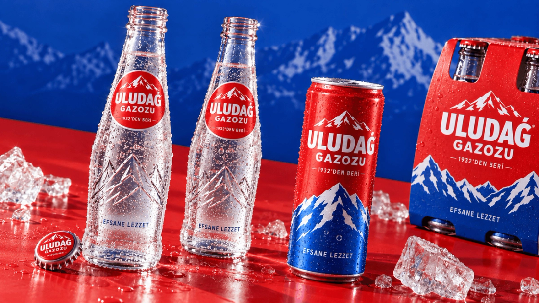
Material and packaging detail
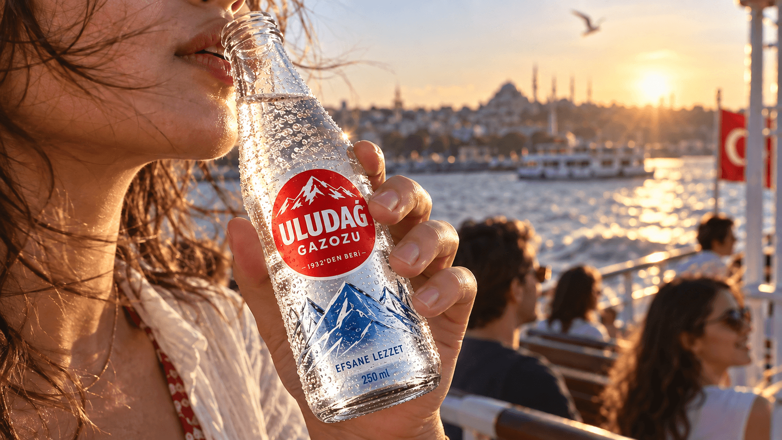
Campaign / Istanbul ferry

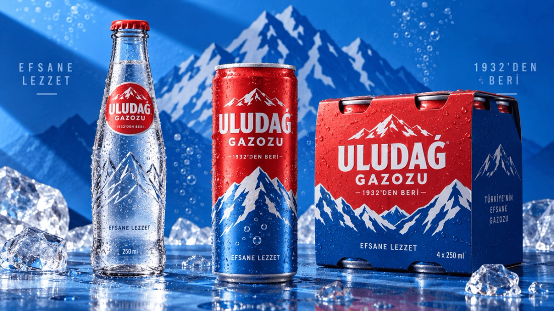
Packaging story

  • Protect the heritage

    The mountain symbol and the memory of 1932 were kept while needless nostalgia was cleared away.

  • Unify the system

    Bottle, can and carrier were tied into the same cobalt-and-red architecture.

  • Take it into life

    The new identity became cold, vivid and recognisable on the ferry and in city life.
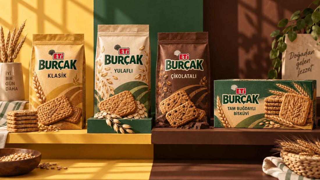
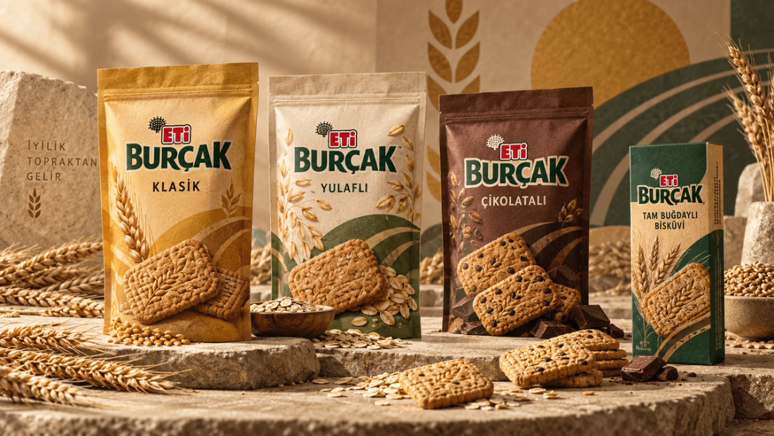
ETİ BURÇAK

ETİ BURÇAK
Variant architecture
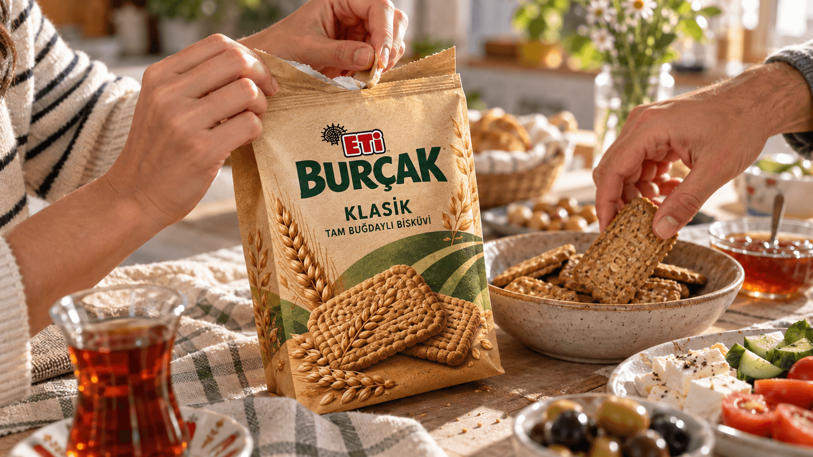
Campaign / breakfast table

Packaging story

  • Make naturalness visible

    The kraft feel was kept while the sameness that silenced the shelf was broken.

  • Speed up the variant

    Classic, oat and chocolate products were separated by large fields of colour.

  • Bring it to the table

    At breakfast, the pack gained a shareable, appetising character.

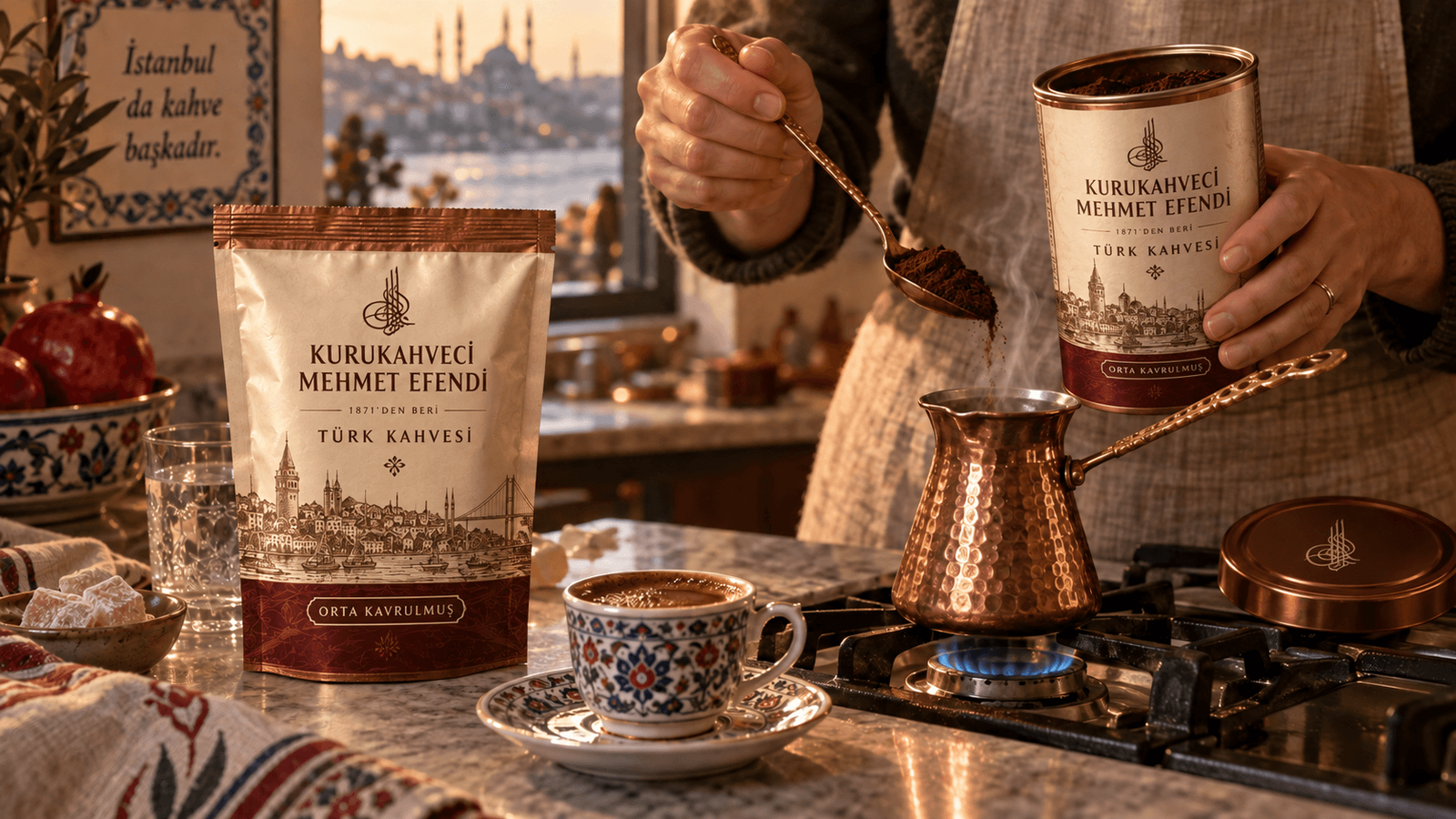
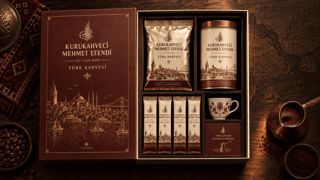
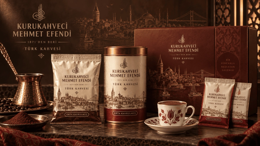
MEHMET EFENDİ

MEHMET EFENDİ
Gift and single-cup system
Campaign / coffee ritual

Packaging story

  • Expand the ritual

    The single foil-pack perception opened up into a keepable tin and gift system.

  • Code the heritage

    The Istanbul engraving, copper and cream became the shared language of every format.

  • Tell the use

    Measuring, brewing and serving became the real story of the product family.

BRANDS FROM SCRATCH.

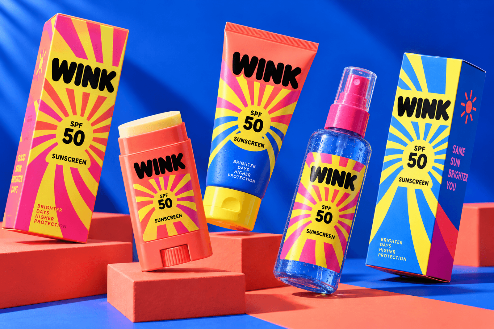
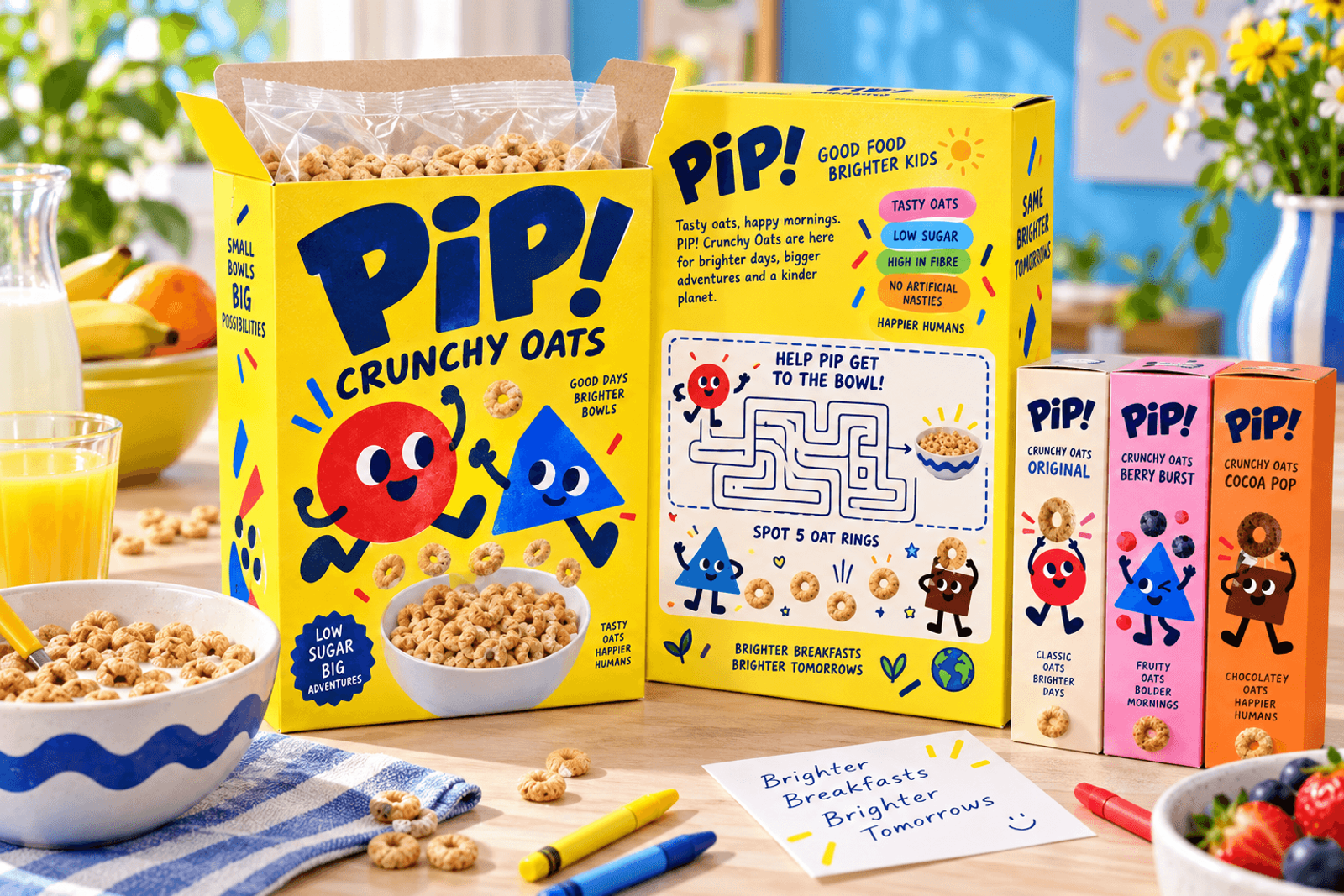
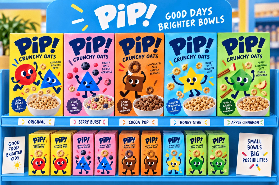
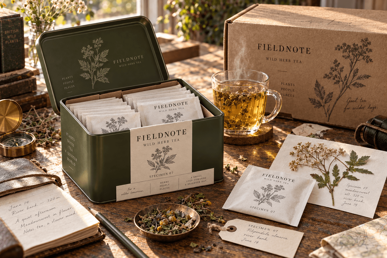
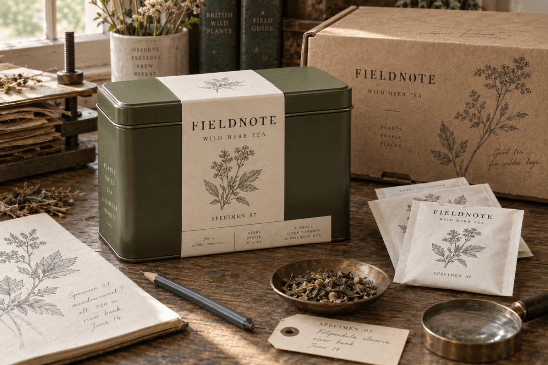
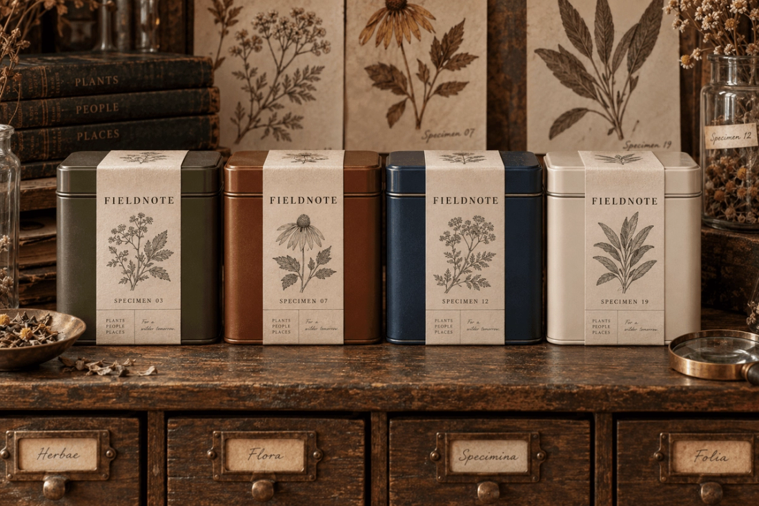
BRUT, WINK, PIP! and FIELDNOTE are not repackaging exercises; they are fictional brand concepts built from scratch, from category insight to name, identity and packaging system.

Each was designed for a real shelf and a real use scenario.

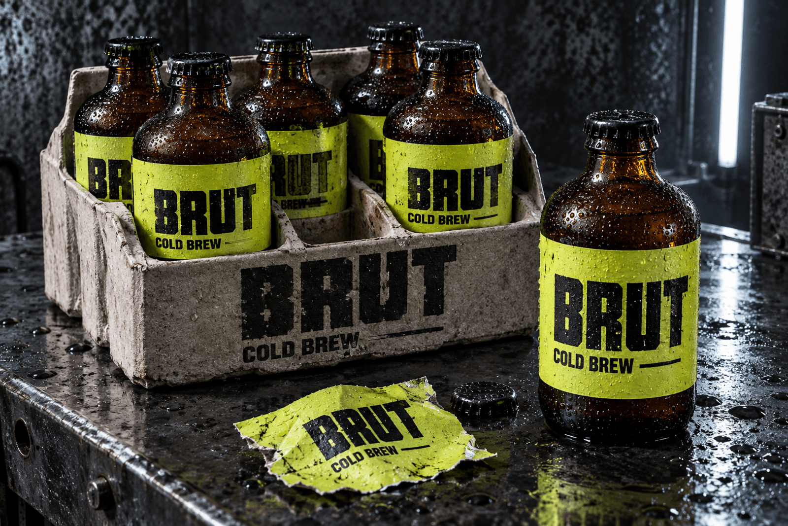
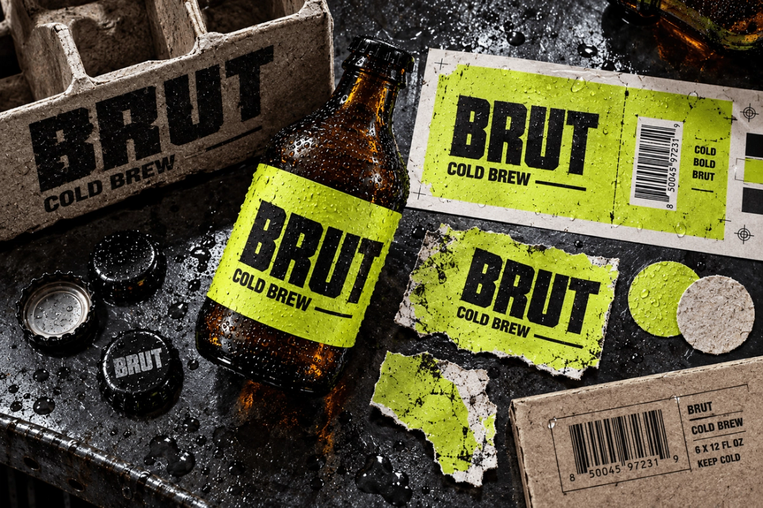
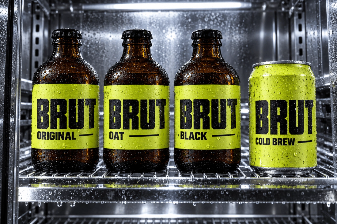
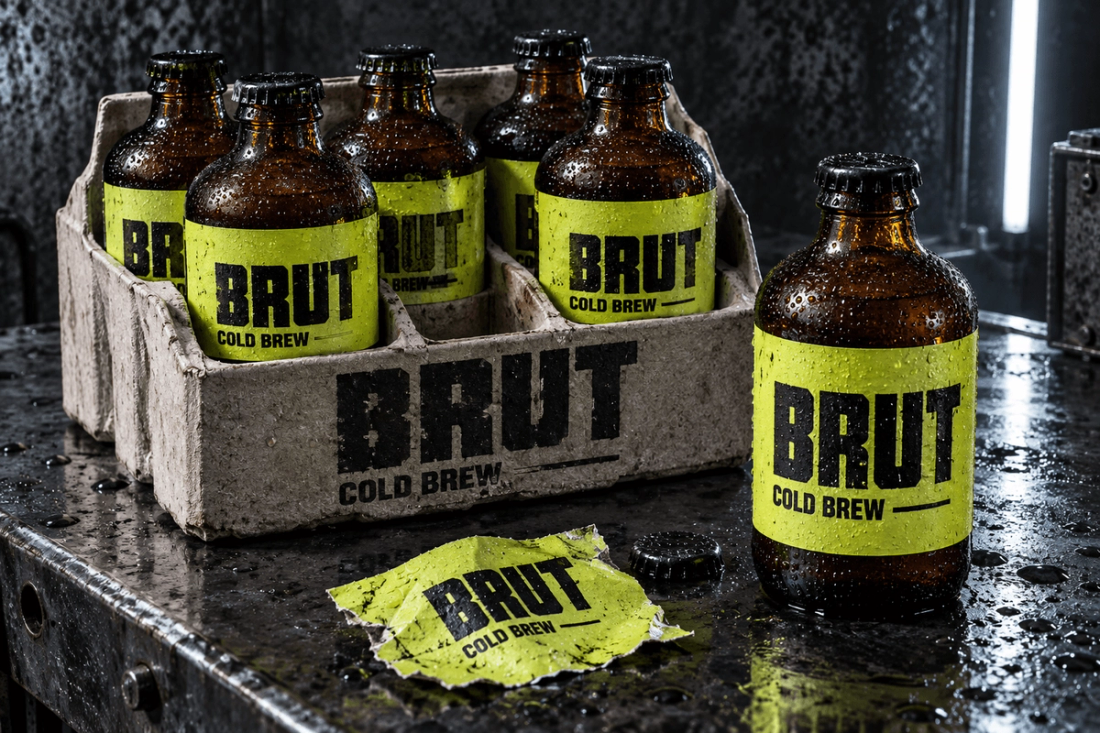
BRUT

BRUT
Product family / 04 formats
Print and material study

Packaging story

  • The specialty coffee shelf was full of calm designs that all looked alike.

  • An acid-green block and a hard wordmark built a structure you recognise from afar.

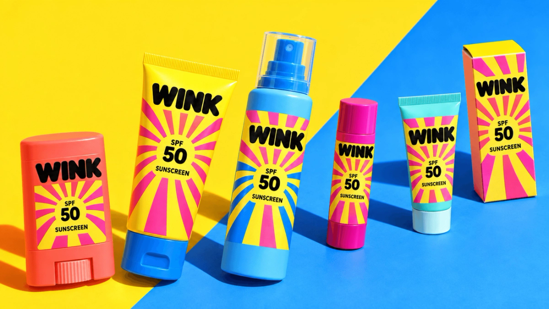
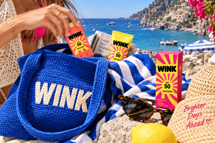
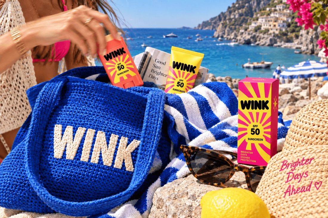
WINK

WINK
Sun series / 06 products
Campaign and everyday use

Packaging story

  • For young users, SPF looked like a clinical, compulsory chore.

  • Colour, tilted composition and portable formats turned it into a daily ritual.

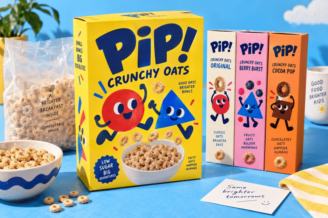
PIP!

PIP!
Flavour system / 05 products
Front, back and breakfast use

Packaging story

  • A healthy-product message bored children; a fun message didn’t reassure parents.

  • The front pairs a playful character with a clear content hierarchy.

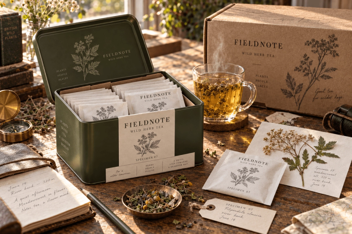
FIELDNOTE

FIELDNOTE
Botanical collection / 04 blends
Ritual and shipping system

Packaging story

  • Handmade tea brands kept repeating the same nostalgic language.

  • Each blend was designed as a numbered botanical record and a keepable object.

ALIVE OFF THE SHELF.

It isn’t enough for packaging to look good. We also show how it behaves in the hand, on the table, in the bathroom and in everyday movement.

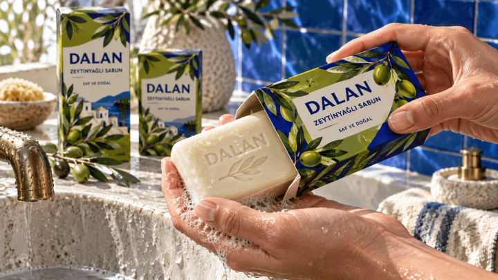
DALAN

DALAN

How the pack really behaves in water, foam and Mediterranean light.

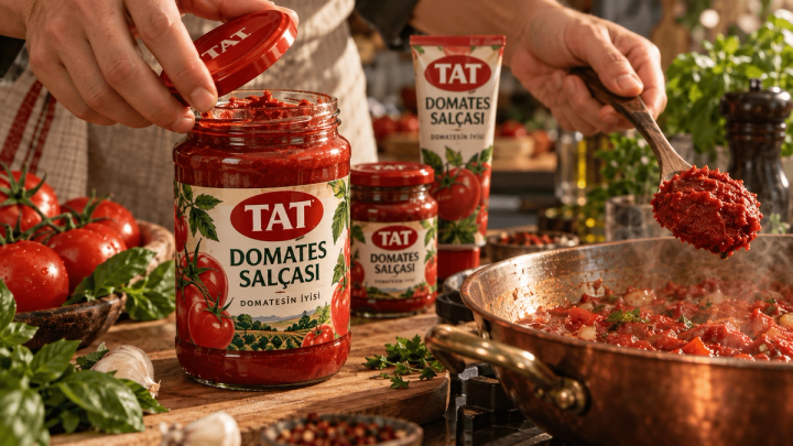
TAT

TAT

The moment the jar on the kitchen counter moves from storing the product to telling its story.

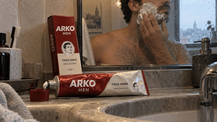
ARKO MEN

ARKO MEN

Instead of a flawless studio, the reality of a metal tube that shows signs of use.

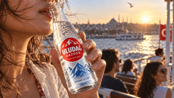
ULUDAĞ

ULUDAĞ

A heritage repositioned through a cold bottle, a sunset and the movement of Istanbul.

WINK

WINK

Turning a category chore into a colourful, portable and social summer habit.

FIELDNOTE

FIELDNOTE

Bringing tin, sachet and the serving moment together in one archive story.